ESPRIT Module system
Project Overview: This project was a part of the ESPRIT global rebrand during 2023.
The objective was to develop a flexible system solution to accommodate brand theme variations across the different global market regions.

My Role
UI/UX Designer (Main point of contact for the project)
Timeline
2023 - 2024
Tools
Figma
Platform
E-commerce
Project Overview
Background & Context
In 2023, ESPRIT undertook a major global rebrand and migrated its e-commerce platform to a new headless cloud architecture. This transition aimed to:
Improve performance and scalability across regions
Allow independent development cycles between EU, EMEA, and new markets
Enable faster launches of brand themes and content
Establish a unified yet flexible design system for global teams
To support the new architecture, a new flexible and scalable module system was needed that could adapt to multiple markets while maintaining global consistency.
Goals & Objectives
✅ Develop a flexible component system to support diverse brand themes across different regions.
✅ Maintain accessibility and usability while adhering to the new branding guidelines.
✅ Create a scalable and modular component system to streamline future updates.
✅ Ensure seamless integration with the existing design system framework.
Challenges
The biggest challenge was enabling flexibility without fragmentation.
Regional markets had different requirements for:
Navigation placement (top vs side)
Product listing layouts
Image ratios and gallery styles
Price formats and labels
Theme-specific colour palettes
Content blocks and spacing rules
The Solution: A Flexible Modular System
We defined a core component library that could accommodate flexible branding variations to be integrated within the existing design system.
Each of the main website pages structure was divided into core sections, which were then populated by flexible components with built-in theme variations, that would cover the different branding styles.
The main focus of the work at that time was placed on the Product Listing Page (PLP) and the Product Details Pages (PDP).
Product Listing Page (PLP) System
Main elements:
Navigation placement: either top or side navigation.
Content section: displays rows of products.
Product card: product image and details, such as displayed colours and price (container within the content section).
With the use of nested components and component variants, we created a flexible system that can cover all content variations and ensure smooth development process.
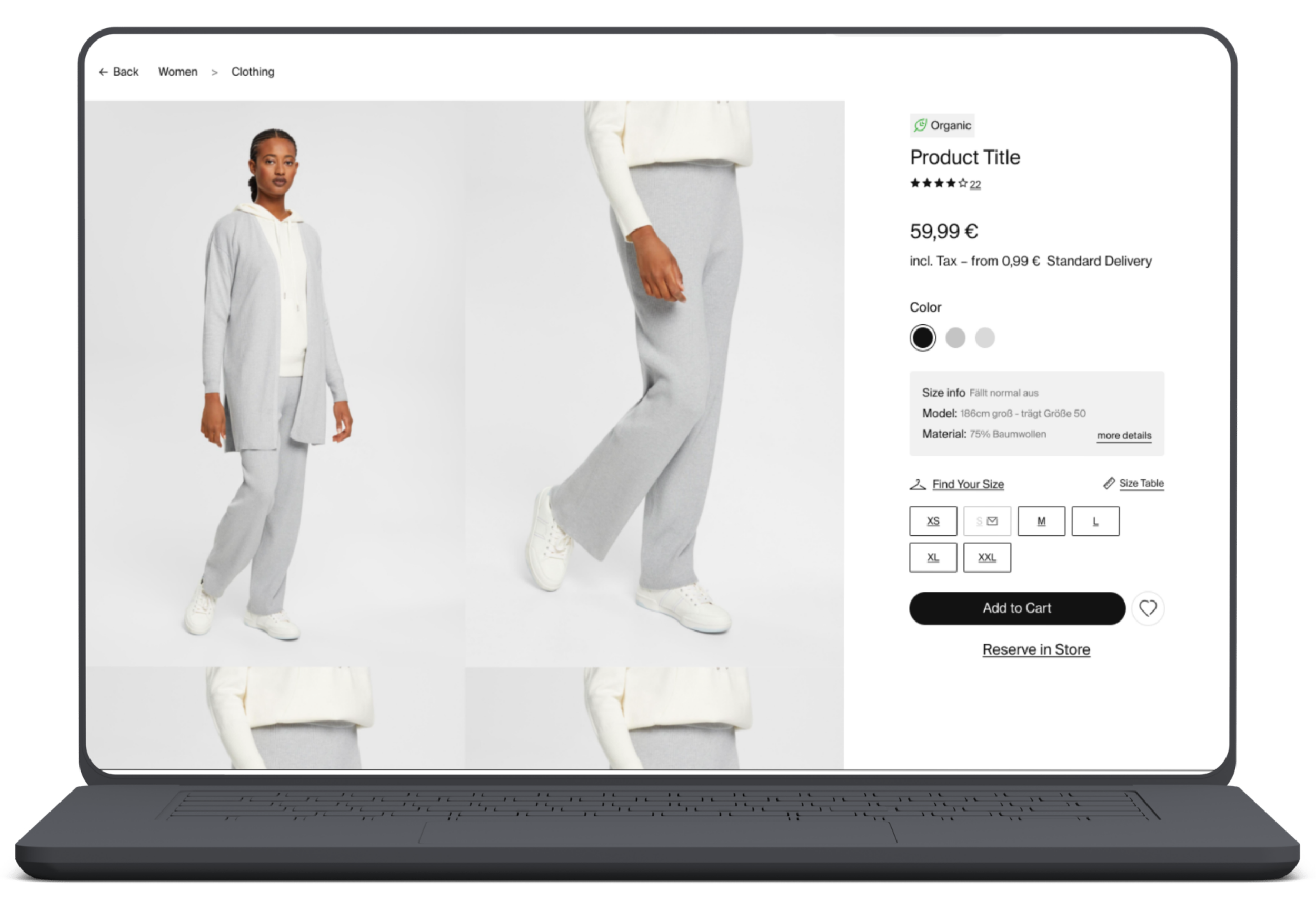
Product Details Page (PDP) System
Main elements: Action Area
The product details page was considered as containing two main elements - product images and product details and CTA (or Action Area). Again, by the use of component variants and themes, the finalised solution was one flexible component covering any design variations.
Design system integration
Component variants & Nested instances (PDP)
Design Specifications

Impact & Results
Design Impact
1 unified Figma library replaced multiple regional files
Component variants reduced duplication and improved design speed

Engineering Impact
Faster implementation of new market themes
Cleaner, scalable front-end structure aligned with headless architecture

Business/Brand Impact
Faster updates during seasonal campaigns
Consistent user experience across EU and EMEA
More coherent brand expression across markets
Project outcomes
✅ Established a scalable component system that seamlessly accommodates brand variations.
✅ Improved efficiency for designers and developers working across different regions.
✅ Ensured a cohesive user experience while maintaining brand flexibility.
Final thoughts & learnings
📌 The importance of modular design in large-scale global brands.
📌 Balancing brand consistency with regional flexibility.
📌 Ensuring usability remains a priority despite branding changes.