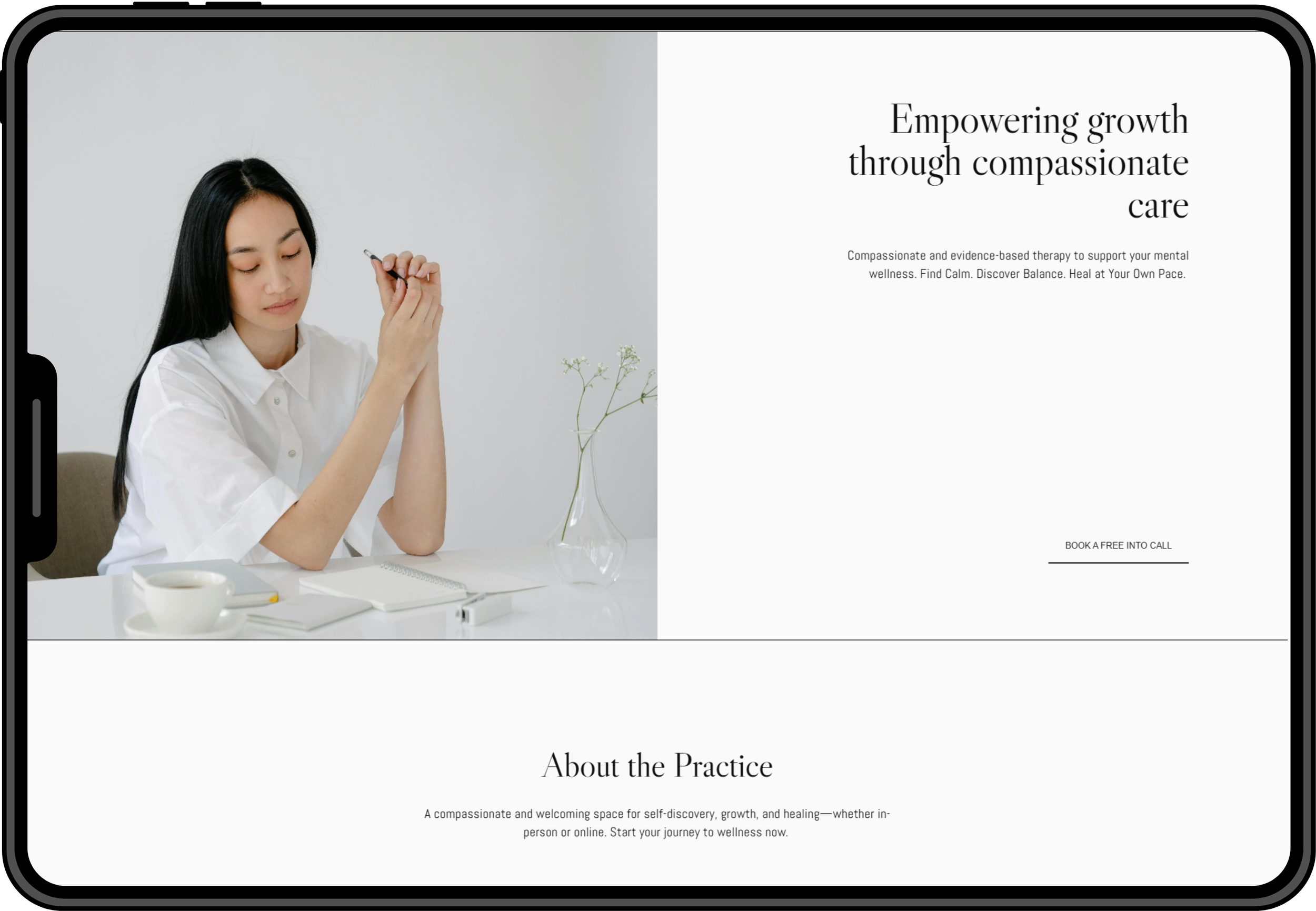
MIRA: High-Converting Website Template for Therapists
Project Overview: MIRA is a high-converting, psychology-informed website template designed specifically for therapists. The goal of this project was to create a trustworthy and easy-to-navigate digital experience that supports both emotional connection and business conversion.
MIRA has become my best-selling template and a product that reflects my combined expertise in Psychology and User-centered design.
Role: Product Designer | UX/UI Designer (end-to-end)
Timeline: 6 weeks (Research → Concept → Design → Launch)
Tools: Figma, Squarespace
Business Outcome: Best-selling template in my shop with excellent client feedback.
1. Overview
Problem
Most website templates available to therapists and wellness professionals were:
Visually overwhelming (bold colors, heavy layouts)
Generic and not tailored to the emotional tone of therapy work
Not optimized for conversion (booking/consultation flows)
Difficult for non-designers to edit
Therapists need simple, trustworthy, calming designs that help them:
Build credibility
Make potential clients feel safe
Convert visitors into consultations or bookings
Goal
Create a website (as a ready-to-use template) that:
Is uniquely tailored to therapists and wellness practitioners
Balances minimalist design with conversion-focused UX
Reflects psychological safety, softness, and trust
My unique angle
With a background in both Psychology + UI/UX design, I understand both:
The emotional needs of therapy clients
The communication challenges therapists face
2. Research
Competitor analysis
I analyzed top-selling templates and therapist websites. Key findings:
Most templates used bold, high-contrast colors
Had generic layouts
Included vague or irrelevant sections
Lacked essential mental-health-specific content (credentials, approach, FAQs)
User Research: Interviews
To understand the needs of therapists and their potential clients, I conducted informal interviews with practicing professionals. They revealed that they feel overwhelmed by building a website and need something that feels calm, human, and easy to understand. Overall, these conversations confirmed the need for a niche, psychology-informed design tailored specifically to the emotional nature of therapy.
These are some of the insights:
“I don’t have the technical skills to build a website, but I need to have a presence online to find clients.”
“I want a website that helps me look credible for potential clients.”
“I struggle to find an effective way to showcase my services/expertise.”
“The goal is to get someone to book a call without the pressure.”
Feature requirements identified
From research, I defined the essential structure:
Clear Services section
About section focused on credentials & approach
Testimonials for trust-building
FAQ to reduce uncertainty/anxiety
Booking / Contact CTA throughout
Soft, minimal visuals and muted colors
3. Problem definition
User Needs

Clear explanation of services
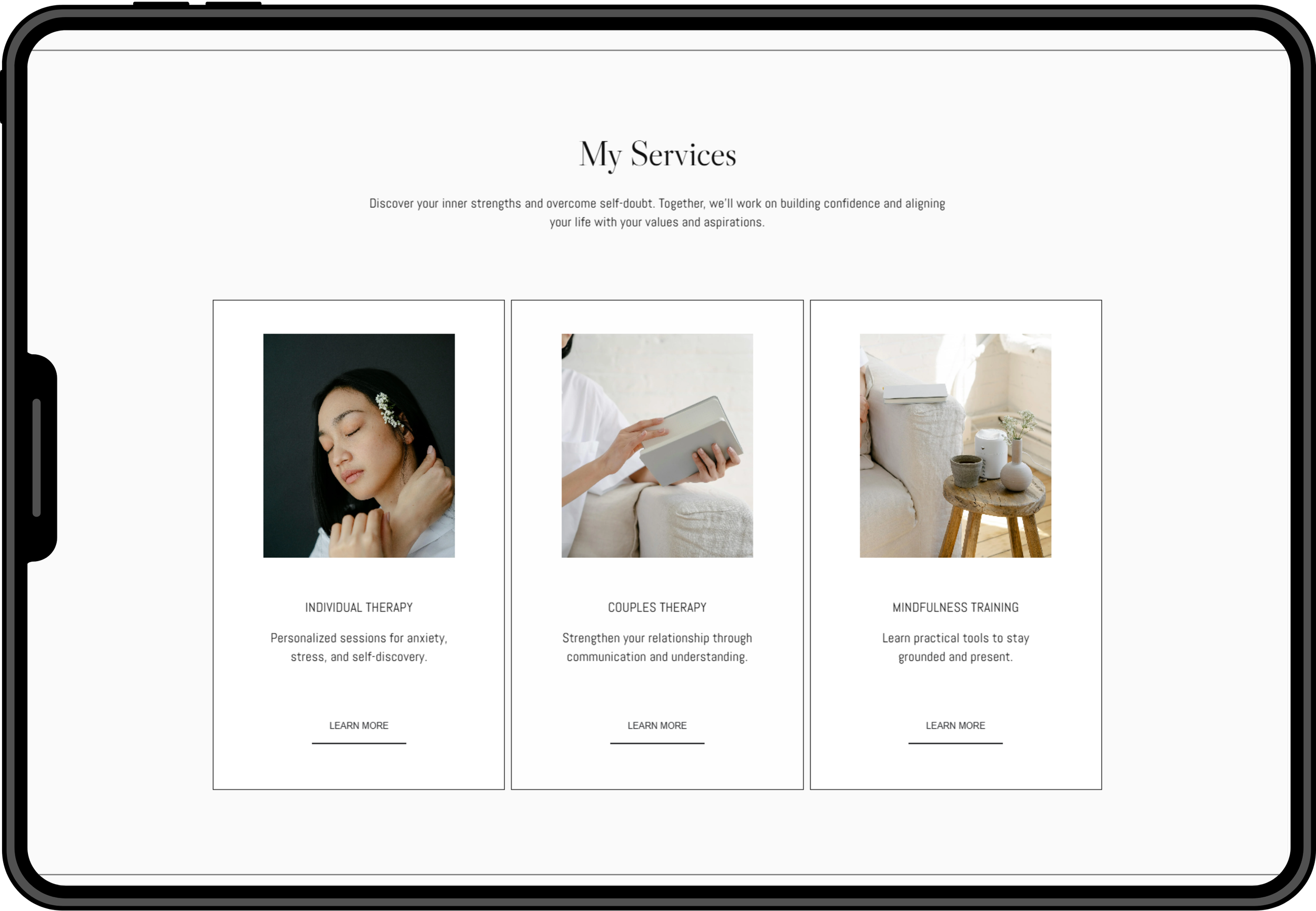
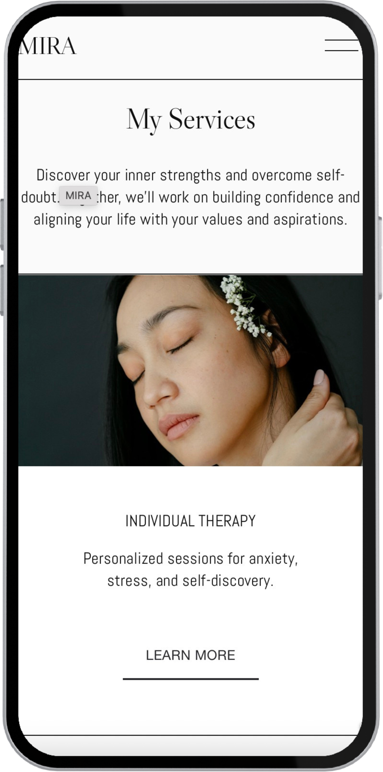
A well-structured Services section helps therapy clients quickly evaluate whether the practitioner’s approach matches their needs, reducing uncertainty and making the next step feel more accessible.

Sensitivity + professional credibility
Therapy clients often arrive feeling anxious, or unsure so the website needs to create an immediate sense of emotional safety. At the same time, the clarity and trustworthiness expected in a professional service should be maintained.

Conversion-focused UX
Instead of pushing users to book, the experience should gently guide them through a clear, reassuring flow. Soft CTAs, predictable layouts and an intuitive structure support conversion by making the path to booking feel natural and low-pressure.
Approach: User journey mapping
The user journey focuses on guiding potential therapy clients through a trust-building experience that supports both emotional reassurance and clear decision-making. I chose this approach because it allows me to align my design choices with the emotional needs of therapy clients.
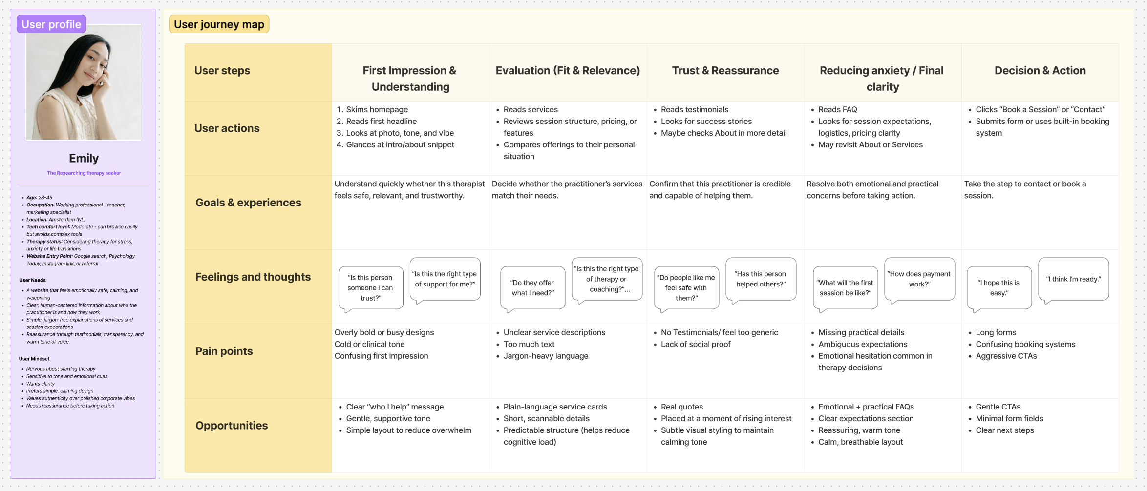
View the full Journey Map in FigJam.
4. Design concept
Design Principles
A soft color palette with gentle contrast to evoke safety.
Minimalist layout with clear hierarchy and digestible content blocks.
Prominent credentials, testimonials, and human photography.
Strategically placed CTAs that feel natural, not pushy.
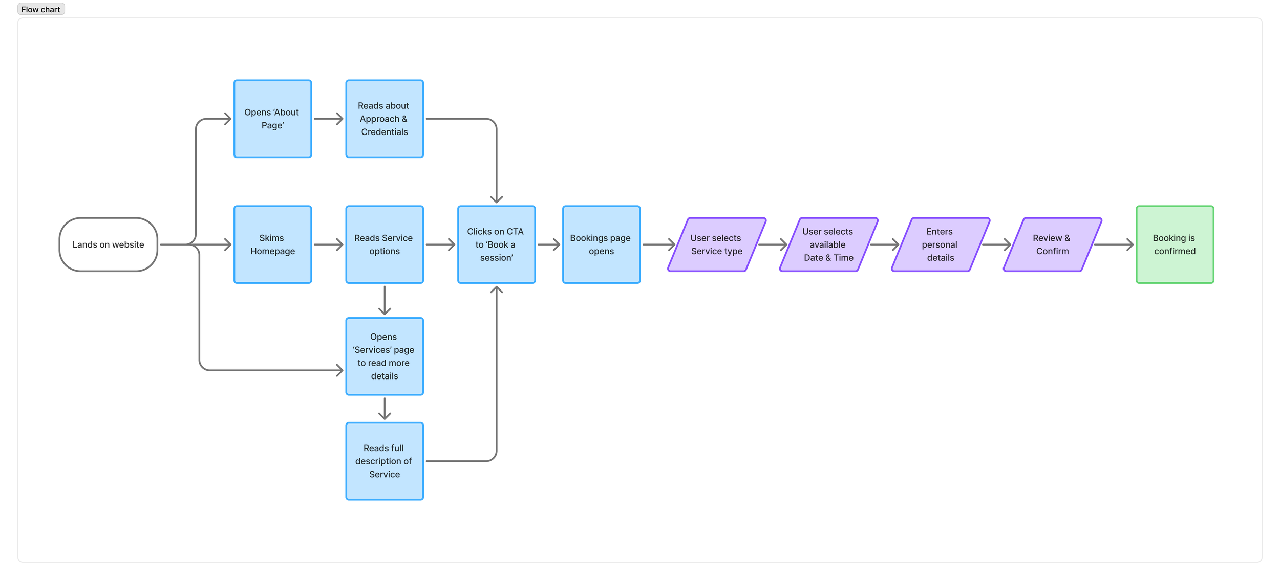
User Flow
To support a smooth booking experience, I designed a clear and intuitive user flow that guides potential clients from exploring services to confidently scheduling a session. Since therapy seekers often feel nervous or unsure when taking the first step, the flow prioritizes clarity, trust-building and minimal friction. The booking process begins with information gathering (via Services pages) and leads into a structured booking path.
Information Architecture
Linear, trust-building flow: Structured the site so users move naturally from safety → understanding → evaluation → reassurance → action, mirroring how therapy clients make decisions.
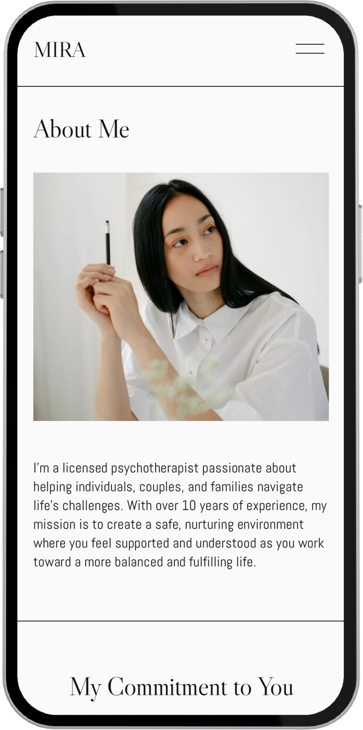
Minimal top-navigation: Reduced global navigation to core items (Home, About, Services, Contact) to decrease cognitive load and avoid overwhelming anxious users.
Clear primary CTA: Chose one main action ("Book a Session") and surfaced it consistently without being pushy.
Consistent section patterns: Used repeating block structures to create a sense of psychological safety, predictability, and ease of comprehension across all pages.
Mobile-first approach: Ensured sections stack in a predictable order with concise headings and clear anchor points that simplify skimming behavior on small screens.
5. Wireframes
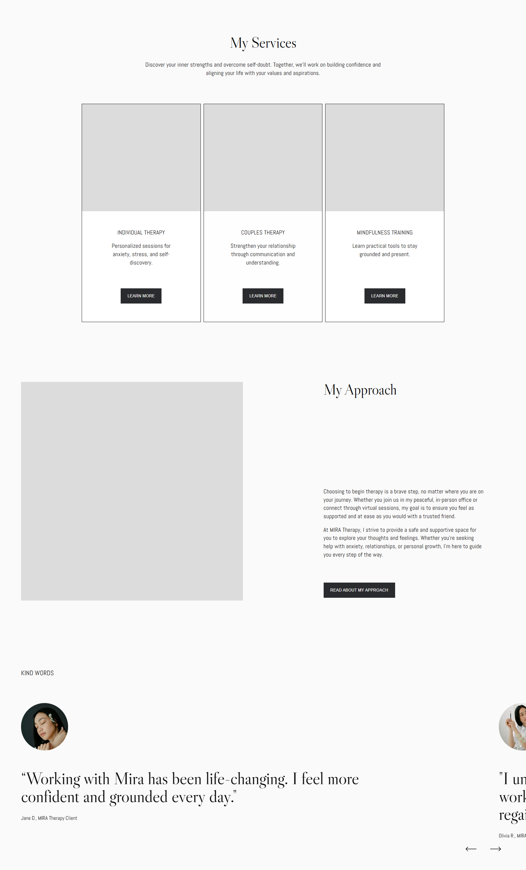
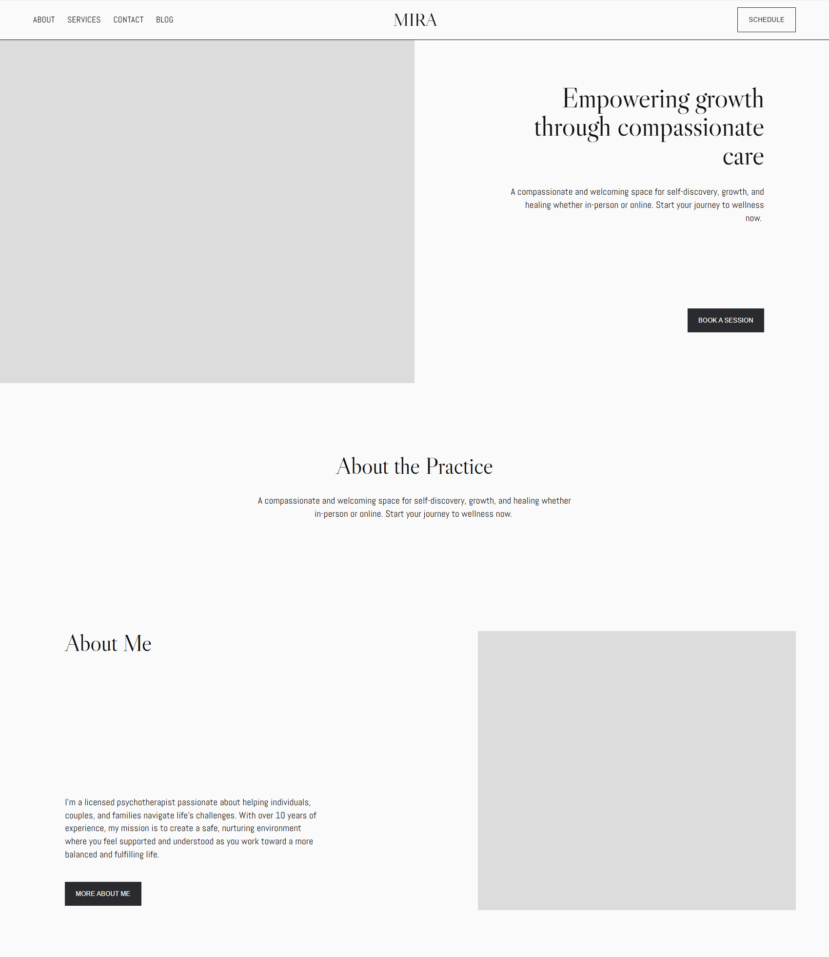
I created low-fidelity wireframes to translate the user journey and information architecture into a clear structure before introducing visual design. The goal was to ensure the layout supported the emotional needs of therapy clients by keeping information simple, scannable and predictable.


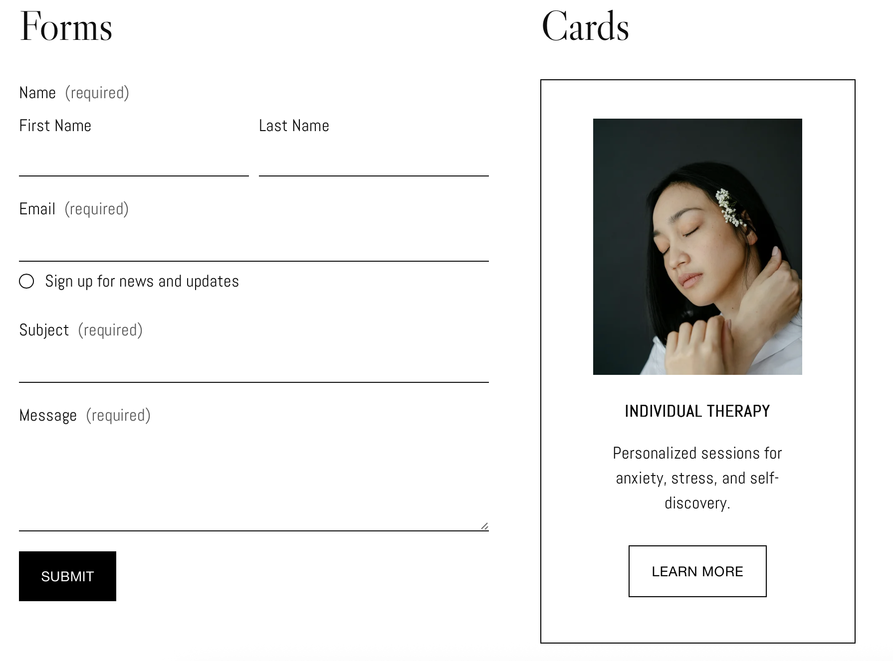
6. Mini Style guide (UI Components)

7. Final design
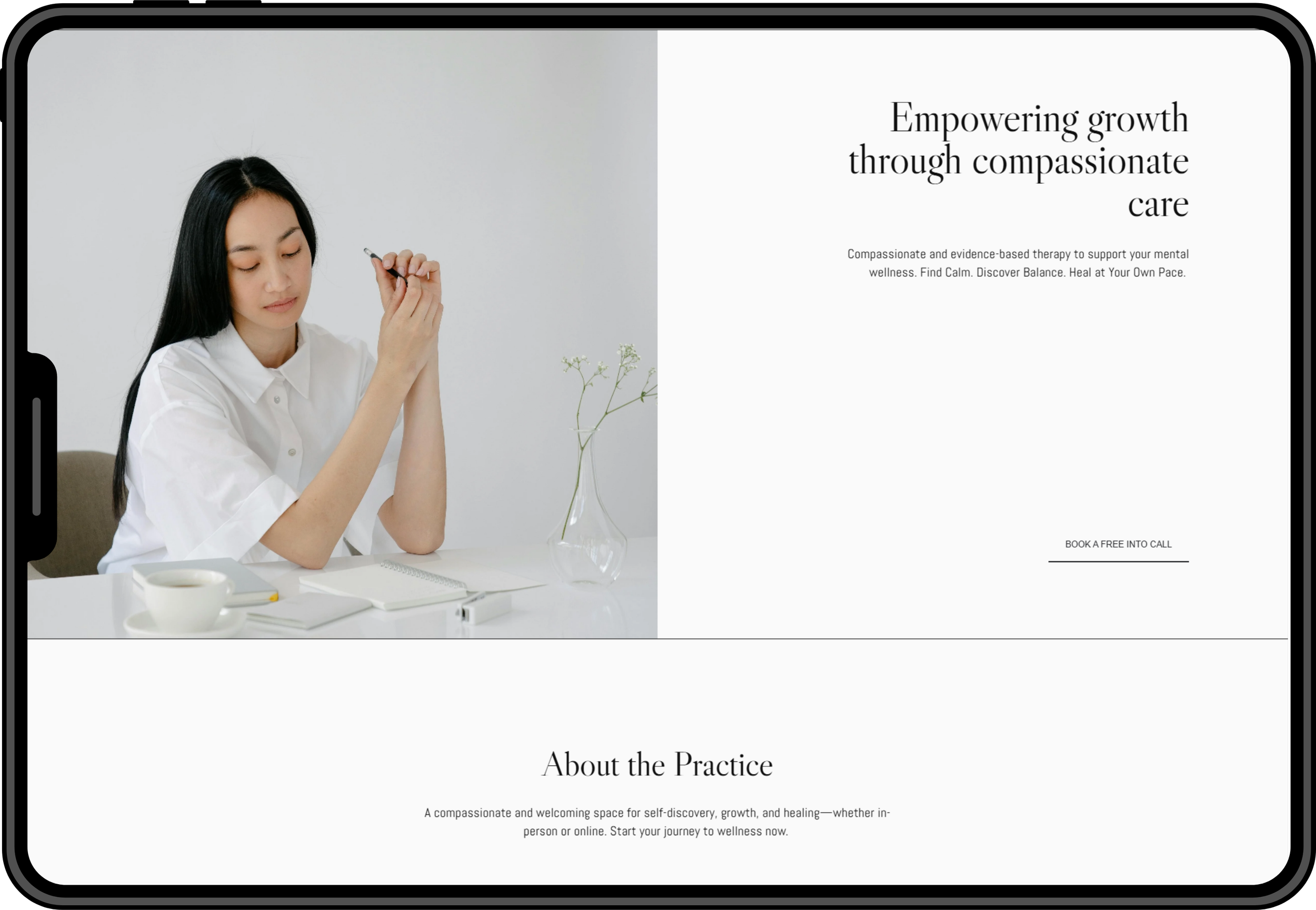
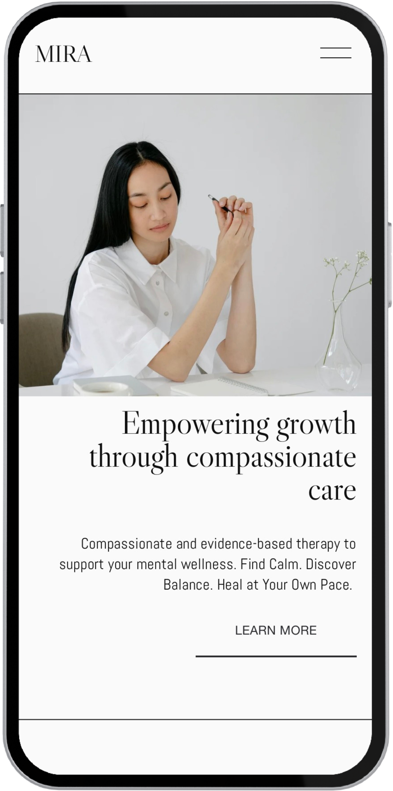
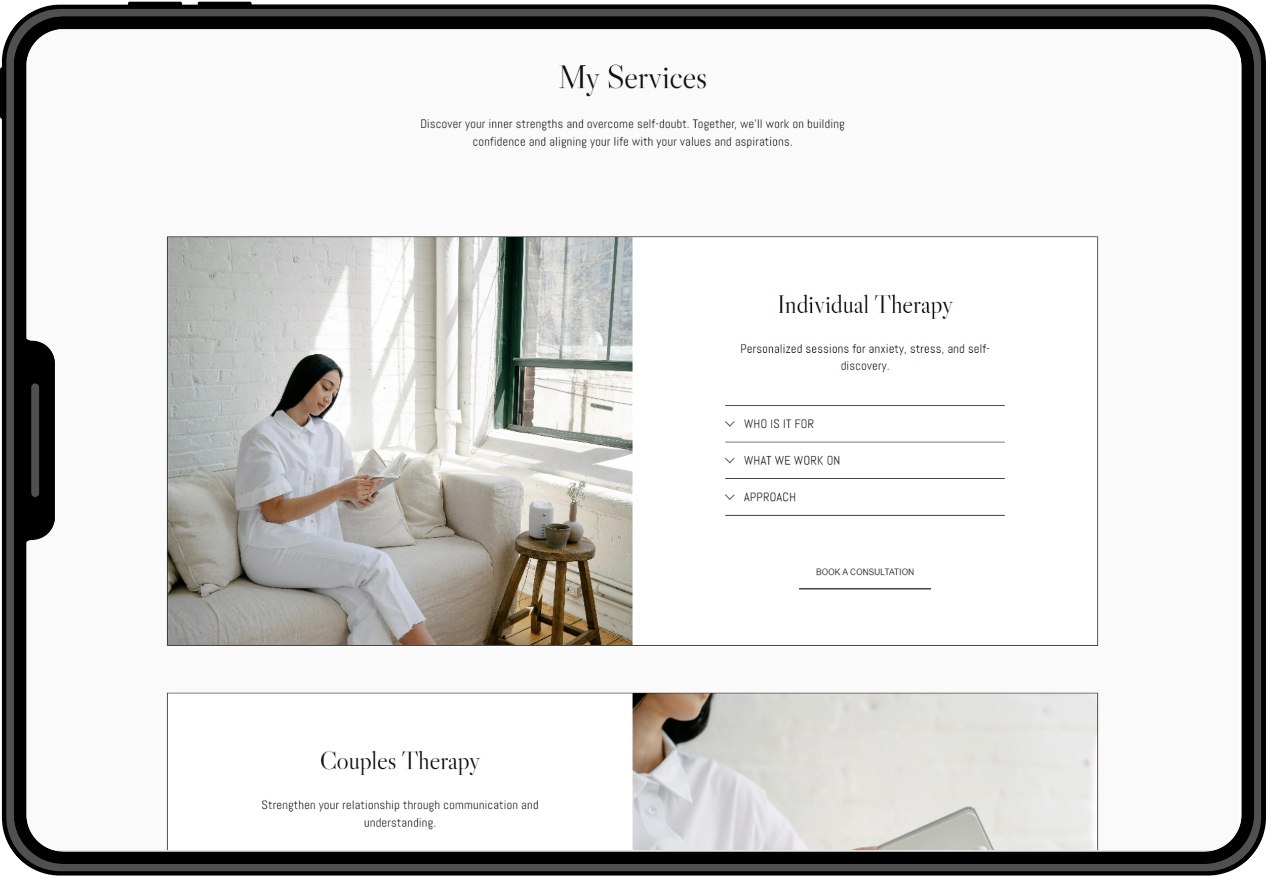
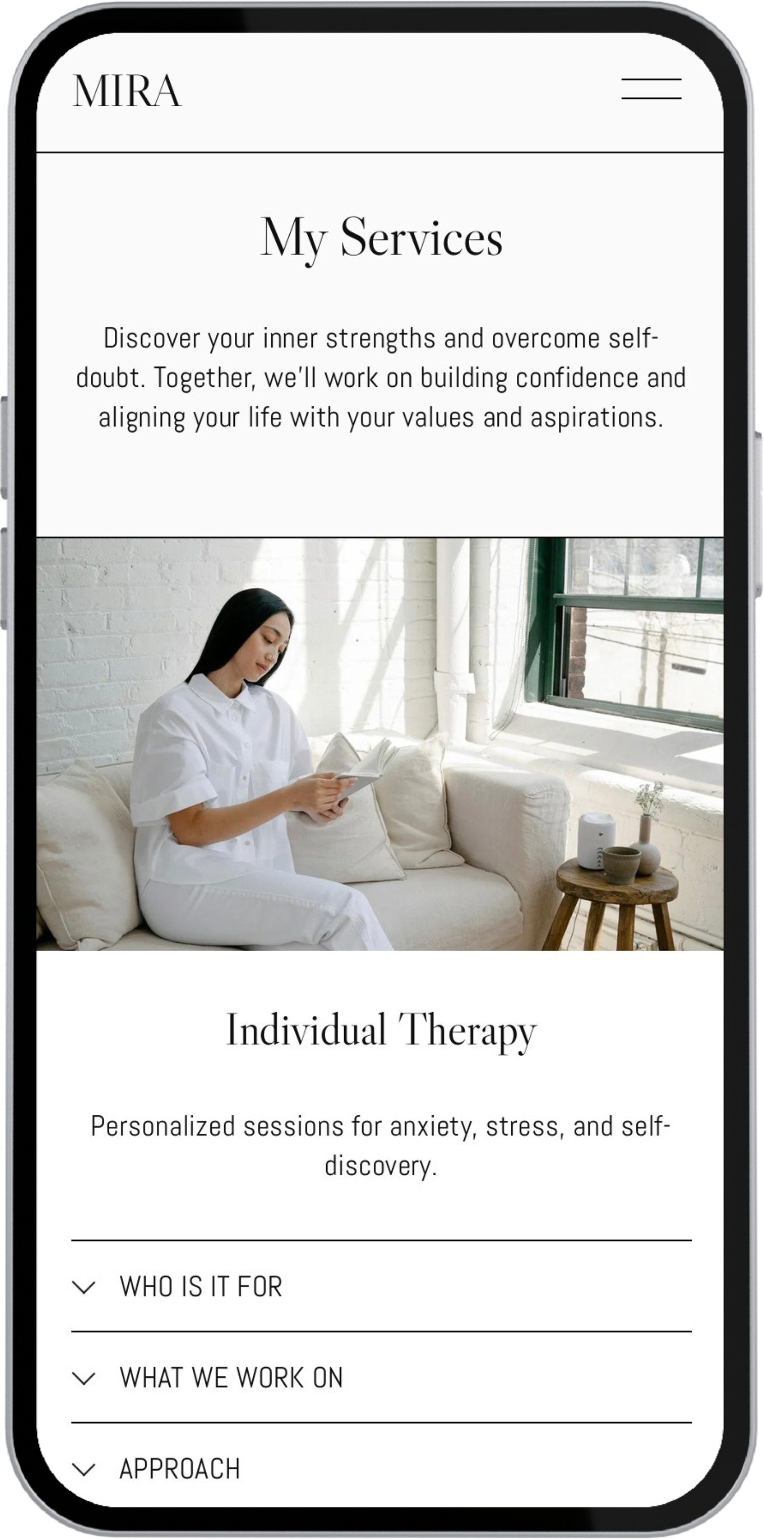
The final design combines a calm visual language with clear, structured layouts to create a supportive experience for therapy clients. Soft typography, spacious sections and gentle CTAs make information easy to absorb while reinforcing trust and emotional safety. The result is a simple, professional template that helps users feel confident moving toward booking and gives therapists an authentic online presence.
Home Page: Hero Section
Home Page: Services cards
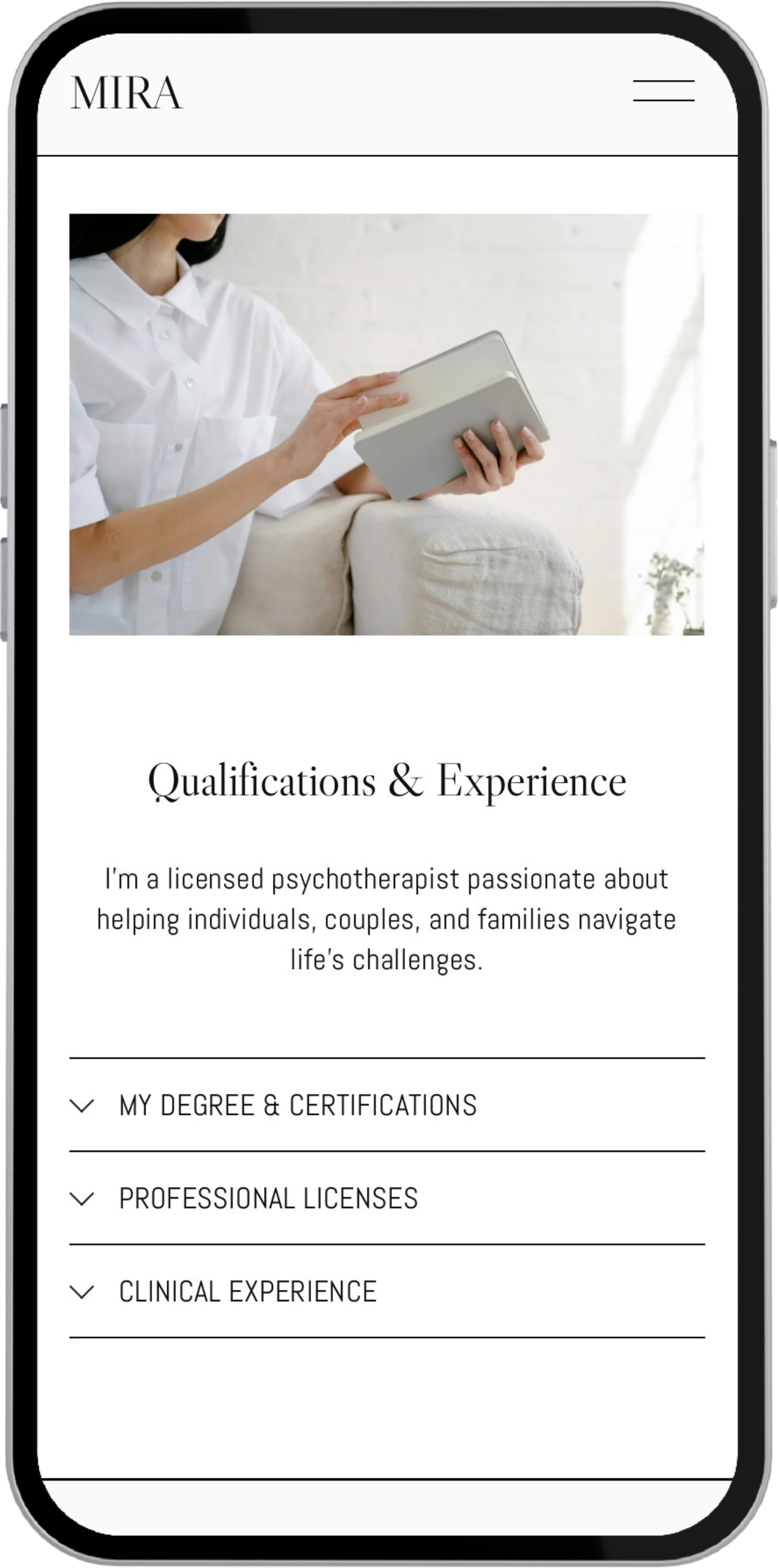
Home Page: FAQs
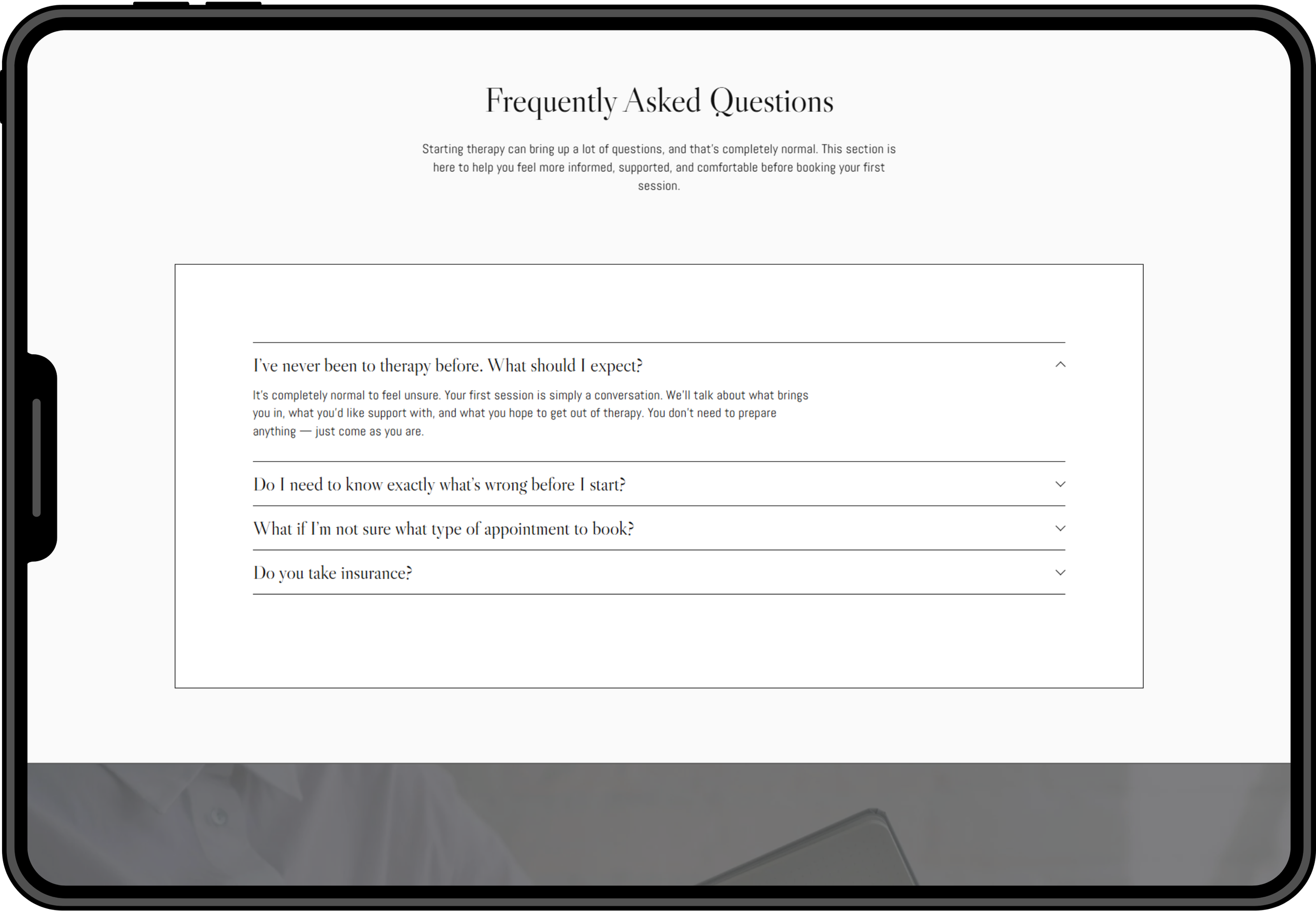
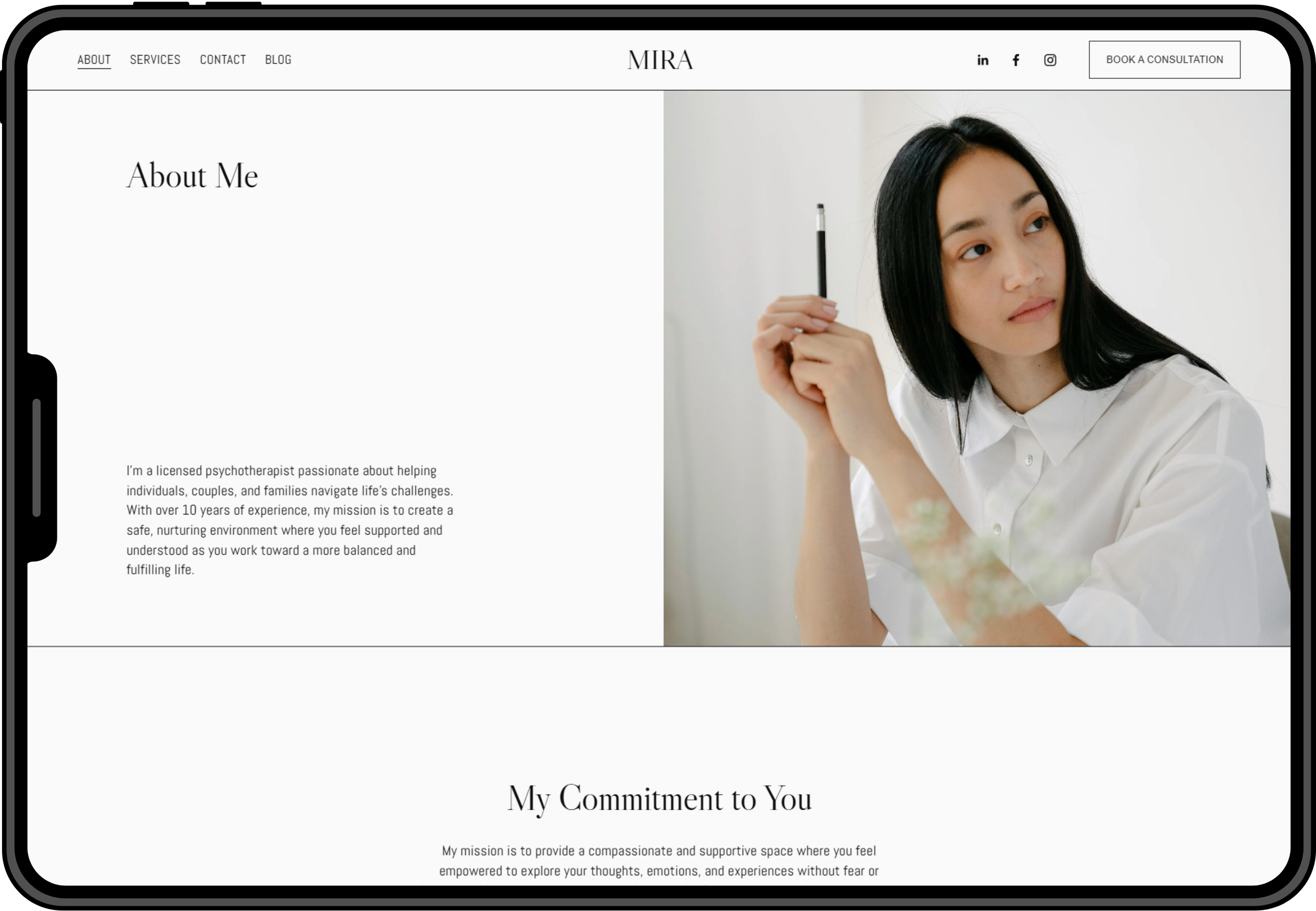
About Page: Hero Section
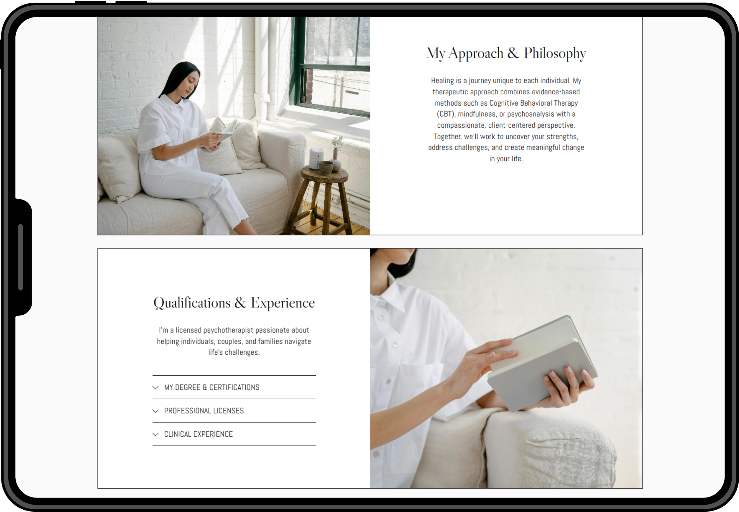
About Page: Approach & Qualifications
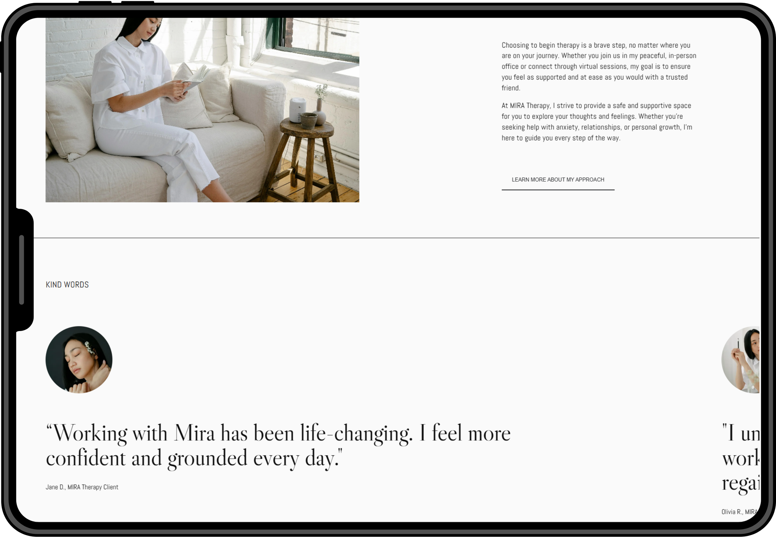
About Page: Testimonials

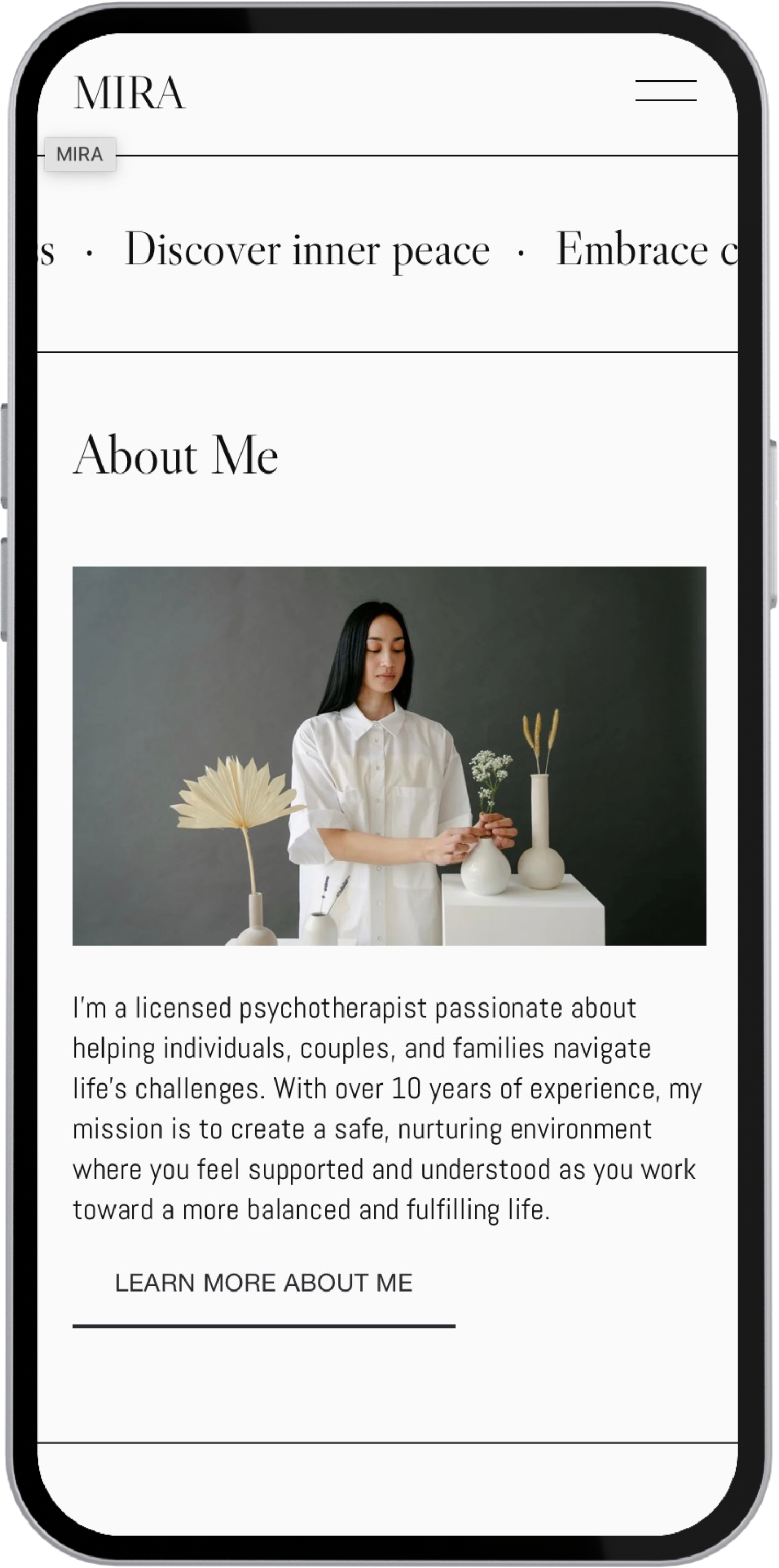
Services Page: Service sections
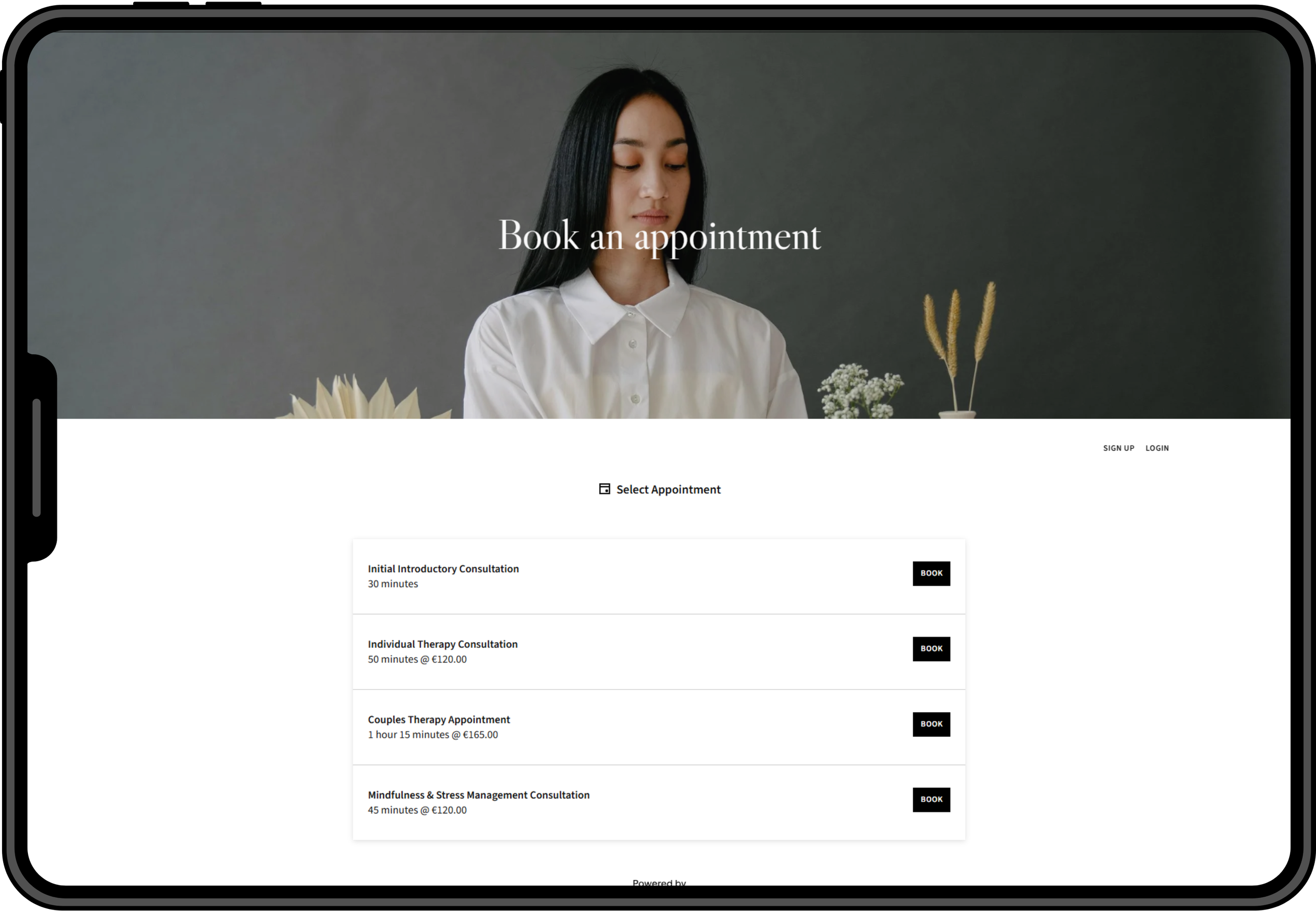
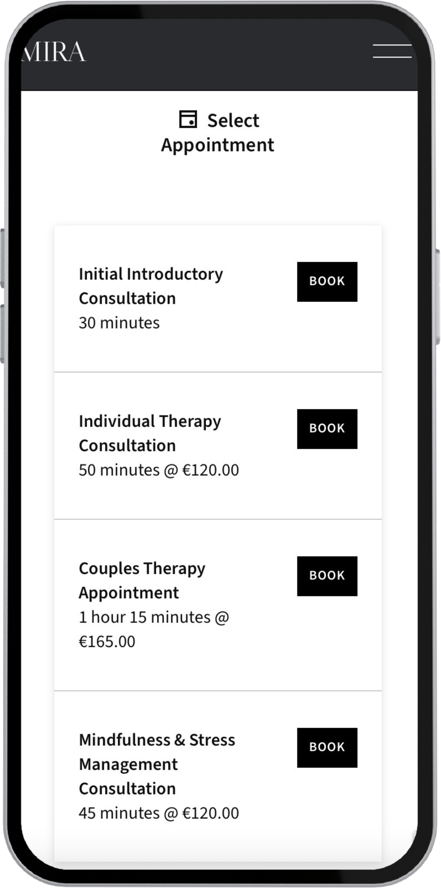
Appointments: Acuity Scheduling Integration
8. Design for Non-Designers
Considerations
Since therapists aren’t usually tech-savvy, I designed the template with:
Modular sections
Pre-styled typographic rules
Image placeholders with clear guides
Layouts that remain intact even with long text
The result: easy updates without breaking design.
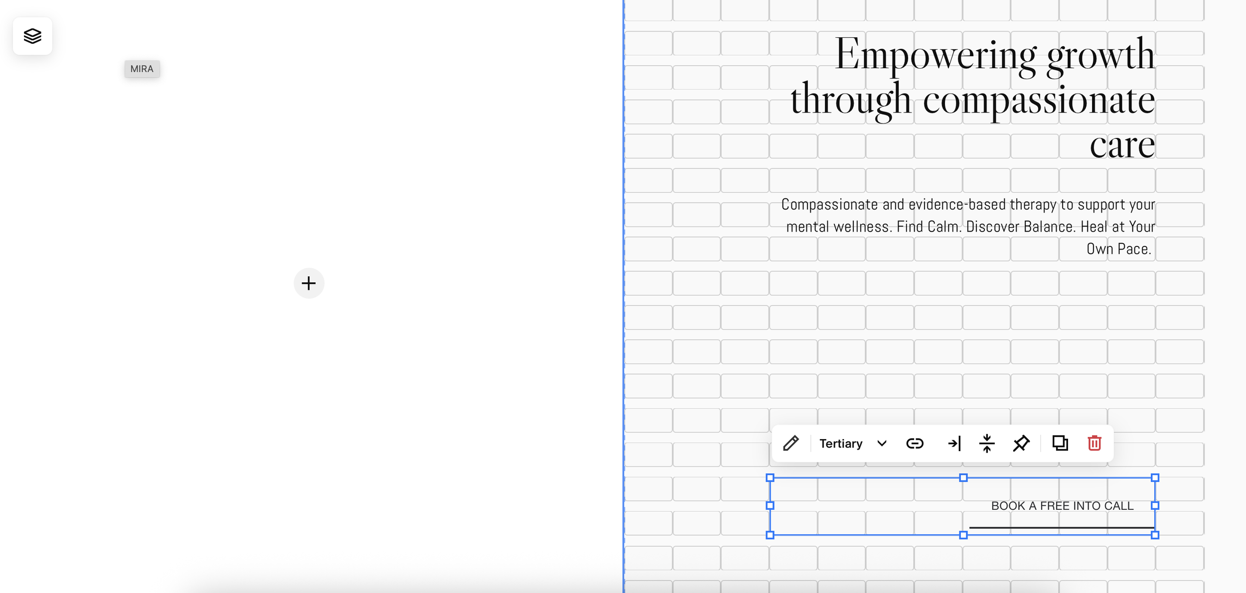
I chose Squarespace since it allows a modular structure for easy edits & website management.
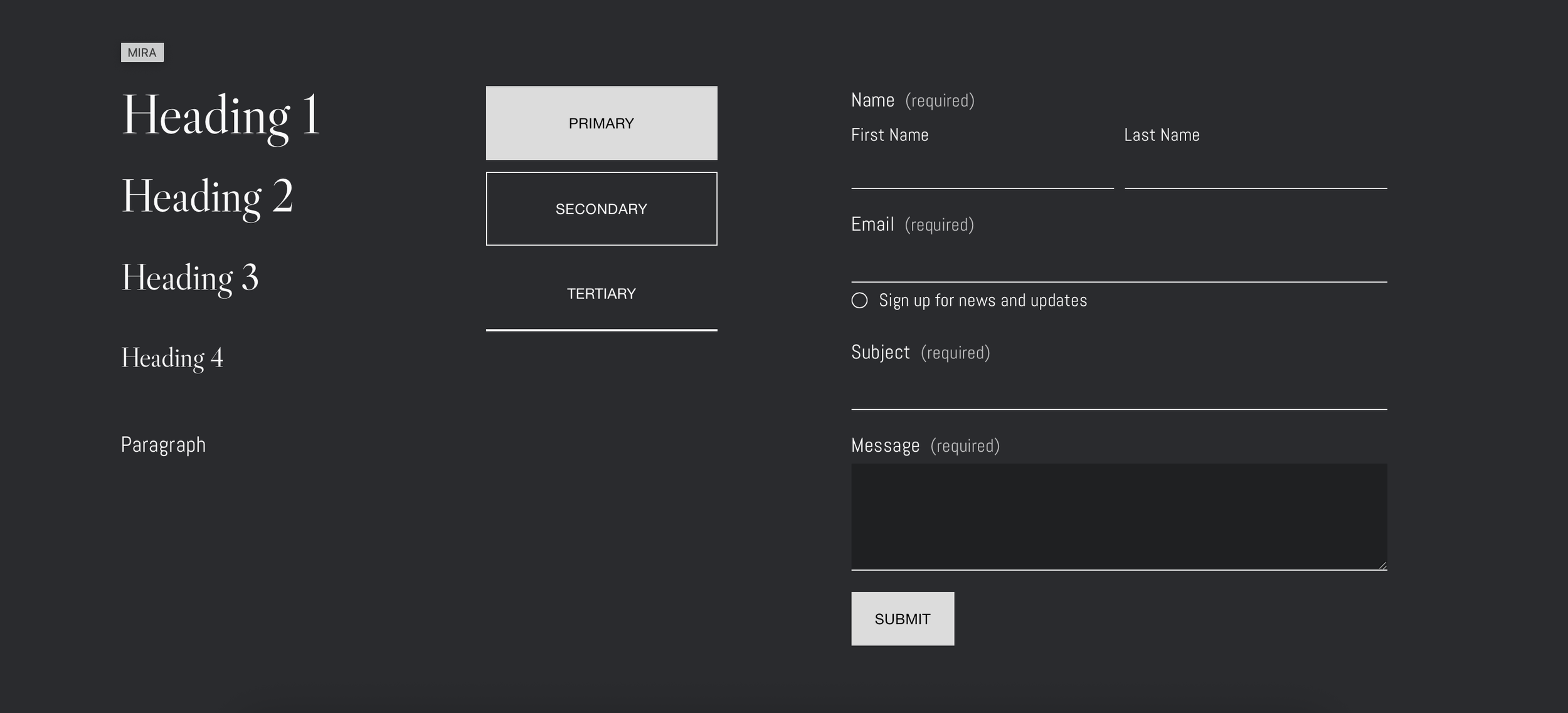
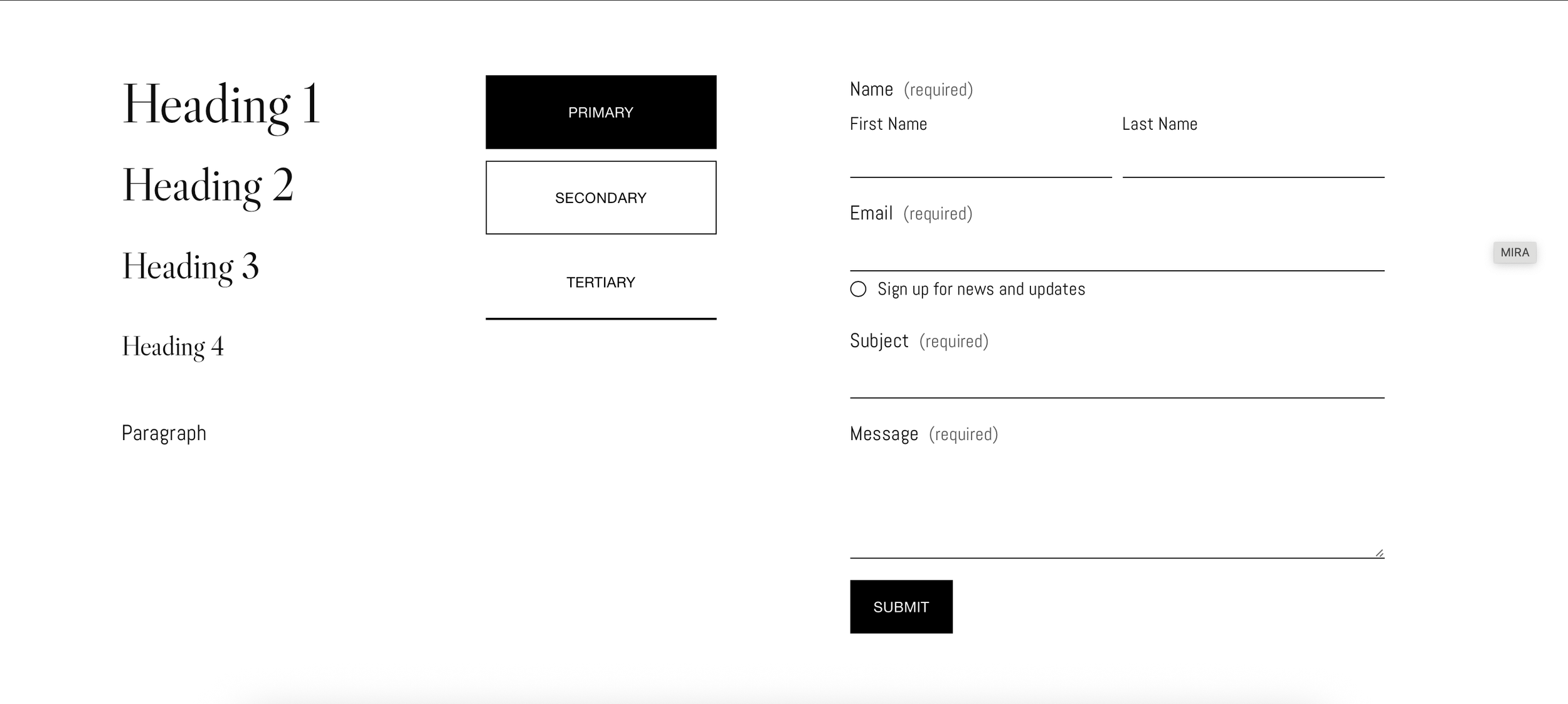
Included pre-defined color themes within the template.
10. Launch & Results

Best-Selling Template
MIRA became my most purchased and favorited template, resonating strongly with therapists and wellness professionals.

Seamless Setup Experience
Customers reported completing the setup smoothly without needing additional support.

Improved Client Conversations
Buyers shared the template helped them present their services more clearly and build trust with potential clients.
Client Feedback Highlights
“Hi Radostina, I love your templates. I am looking to start an online therapy business and your templates are very calming.“
“Thank you Radostina! Great work! “
“Thank you Radostina! Your designs are gorgeous and I can't wait to get started with the site.”
“Great template! I launched my website and it even brought me two new client inquiries!”
11. Learnings & Reflection
What I learned
Designing for a niche requires deeper understanding, not assumptions.
Speaking directly with therapists helped me see how their needs differ from typical small-business owners. They needed a template that balanced professionalism with warmth and many struggled with clearly communicating their services. These conversations grounded the entire project in real practitioner needs rather than surface-level design trends.
How the end user needs shape the entire experience.
Designing for therapy clients required a very tailored approach taking into consideration the user needs at every step of the process. Potential clients often arrive feeling anxious, overwhelmed, or unsure, which meant the design had to gently guide them, without pushing, towards clarity and action.
Final reflection
MIRA was a passion project of mine that let me combine my background in psychology with my love for user-centered design. Speaking directly with therapists shaped the entire direction of the template - it helped me understand their specific struggles and what they needed to feel confident online. At the same time, I kept the therapy client at the center of every decision, designing a calm, supportive experience that gently guides users through what can be an emotional process. This project reminded me how impactful design becomes when it’s grounded in empathy, real conversations and a deep understanding of the people you are creating for.
